Table of Contents
Fonts are a fundamental element of graphic design. They play a vital role in enhancing the overall visual appeal of the design and communicating the message effectively to the audience. Choosing the right font can make all the difference in creating a successful design. Fonts are a crucial element of graphic design that affects the overall aesthetic, readability, and communication of the design. Choosing the right font can create a visual hierarchy, convey personality and emotions, aid in brand recognition, and enhance the readability of the design. Therefore, it is essential to give proper attention to font selection when creating a design
Let’s discuss the importance of fonts in graphic design and how they impact the overall aesthetic of a design;

Fonts and Visual Hierarchy
Fonts can create a visual hierarchy within a design by differentiating between the various elements of the design, such as headlines, subheadings, body copy, and captions. A visual hierarchy is the arrangement of these elements in a design that guides the viewer’s attention to the most important information first.
1. Font Style & Sizes
One way to create a visual hierarchy with fonts is by using different font styles and sizes for each element. For instance, a bold and large font can be used for headlines, while a lighter and smaller font can be used for body copy.
This immediately communicates to the viewer that the headline is the most important element and should be read first.
2. Font Colors
Another way to create a visual hierarchy with fonts is by using font color. Bold, dark colors can be used for headlines, while lighter colors can be used for subheadings and body copy.
This can help differentiate between the various elements of the design and make it easier for the viewer to navigate the information.
3. Font Weight
Additionally, font weight can also be used to create a visual hierarchy. A heavier weight font can be used for more important elements, while a lighter weight font can be used for less important elements.
This creates a contrast between the different elements and draws the viewer’s attention to the more important information.
Font Hierarchy Example
In the following example, the hierarchy of importance is clear. It forces the reader to read the elements in the wanted order and tells a story in an organic fashion while being creative with the design layout.
- First Level: “Your Brand” or the logo name is in a brand-specific color and the font size is the largest.
- Second Level: “Tagline Here” is in the brand-specific color and the font size is the second largest.
- Third Level: “Your Text Here” is in a dark grey color (different from the brand color) with smaller and thinner font than the second level.
- Fourth Level: “ESTD XXXX” is in a dark grey color (different from the brand color) with smaller and thinner font than the third level.

Fonts Convey Emotions & Personality
Fonts can convey emotions and personality in design by using their unique characteristics such as style, weight, spacing, and color. The choice of font can influence the overall tone and mood of the design, and evoke different emotions in the audience. Here are some ways fonts can convey emotions and personality in design:
1. Font Style
Different font styles have different personalities and can evoke different emotions. For example, a serif font can convey a sense of tradition and elegance, while a script font can convey a sense of luxury or exclusivity. A sans-serif font is more modern and sleek, and can evoke a sense of minimalism or simplicity.
2. Font Weight
Font weight can also impact the emotion and personality conveyed in a design. A bold, heavy font can convey strength, urgency, or importance, while a lighter font can convey playfulness or relaxation.
3. Font Spacing
The spacing between letters and words in a font can also impact the emotion and personality conveyed in a design. Tight spacing can create a sense of urgency, while wide spacing can create a sense of calmness or openness.
4. Font Colors
The color of the font can also convey emotions and personality. For instance, a bold, red font can create a sense of urgency or importance, while a soft, pastel color can convey a sense of calmness or relaxation.
5. Consistency
Consistently using the same font throughout a design can create a cohesive look and convey a sense of professionalism or sophistication.
Font Personality Example
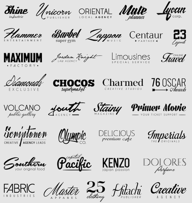
Here are some examples of personalities that fonts can give to logo designs:
Bold and thick fonts like Impact or Bebas Neue can convey a sense of strength, power, and confidence. They are often used for sports brands or companies that want to create a strong impression.
Script fonts like Brush Script or Great Vibes can convey a sense of elegance, sophistication, and femininity. They are often used for fashion brands, beauty products, or wedding services.
Serif fonts like Times New Roman or Georgia can convey a sense of tradition, history, and professionalism. They are often used for law firms, universities, or financial institutions.
Sans-serif fonts like Helvetica or Futura can convey a sense of modernity, simplicity, and minimalism. They are often used for tech companies, design studios, or fashion brands that want to convey a contemporary look.
Handwritten fonts like Pacifico or Amatic SC can convey a sense of playfulness, creativity, and authenticity. They are often used for food or beverage brands, indie music labels, or lifestyle blogs.
These are just a few examples of how different font personalities can be used to create a unique and effective logo design. When choosing a font for a logo, it’s important to consider the brand’s personality, values, and target audience to ensure that the font accurately reflects the brand and resonates with its intended audience.

Fonts for Brand Recognition
Fonts play a significant role in creating brand recognition because they are one of the primary visual elements that people associate with a brand. A font can convey a brand’s personality and tone, and can also help to make a brand stand out in a crowded marketplace.
Here are some ways in which fonts can aid in creating brand recognition:
Consistency: Using a consistent font across all brand communications, including marketing materials, websites, and packaging, helps to create a consistent visual identity that customers can easily recognize.
Differentiation: Choosing a unique font that stands out from competitors can help a brand to be more memorable and recognizable.
Brand personality: Different fonts can evoke different emotions and attitudes, so choosing a font that aligns with the brand’s personality can help to reinforce the brand’s messaging and values.
Legibility: A font that is easy to read can make a brand’s messaging more effective and memorable.
Adaptability: Using a font that can be used across a variety of mediums, from digital to print, can help to create a cohesive and recognizable brand identity.
In short, fonts are a crucial visual element that can help to create a strong and memorable brand identity. By choosing the right font and using it consistently, a brand can reinforce its messaging and stand out in a crowded marketplace.
Are Your Fonts Adaptable to all Media?
There are many different media where a company logo can be applied, including:
Website: One of the most common places to display a company logo is on a website.
Business cards: A logo is a great addition to a business card, as it can help create a memorable and professional first impression.
Letterheads: Including a logo on a company’s letterhead can help establish a strong brand identity and professionalism.
Brochures: Including a logo in brochures and other marketing materials can help make them more visually appealing and memorable.
Advertisements: A company’s logo can be included in print, digital, or outdoor advertisements to increase brand visibility.
Merchandise: Logos can be applied to a wide range of merchandise, such as t-shirts, hats, mugs, and other promotional items.
Social media: Including a logo on social media profiles can help reinforce a company’s brand identity and make it more recognizable to followers.
Signage: A company’s logo can be displayed on signage outside of their physical location, making it easier for customers to find them.
Packaging: Logos can be applied to product packaging, which can help make them more eye-catching on store shelves.
Overall, there are countless ways to apply a company logo across various media to help establish a strong brand identity and increase brand visibility.

Fonts and Readability of a Design
Fonts can have a significant impact on the readability of a design. The right font choice can improve readability and help convey the intended message to the audience, while the wrong font can make the design difficult to read and cause confusion or misinterpretation.
Here are some ways fonts affect the readability of a design:
Legibility: The legibility of a font refers to how easy it is to distinguish each letter or character in the font. Fonts with clear, distinct letterforms and sufficient spacing between letters are more legible and easier to read than fonts with complex or unclear letterforms.
Size: The size of a font also affects its readability. Fonts that are too small may be difficult to read, especially for audiences with visual impairments. Conversely, fonts that are too large may be overwhelming and cause fatigue or discomfort to the eyes.
Weight: The weight of a font refers to how thick or thin each letter is. Fonts that are too light may appear faint or difficult to read, while fonts that are too heavy may appear bold or overwhelming.
Contrast: The contrast between the font and the background can also affect readability. A high contrast between the font and background, such as black text on a white background, is generally easier to read than low contrast designs.
Style: The style of a font can also affect readability. Fonts that are too decorative or ornate may be difficult to read, while simple and clean fonts are often more legible.
In summary, fonts can greatly impact the readability of a design by influencing legibility, size, weight, contrast, and style. It’s important to carefully consider the font choice when designing for readability and to ensure that the font is appropriate for the intended audience and message.

Where to Find Free Fonts
There are many websites where you can find free fonts for personal and commercial use. When downloading and using free fonts, be sure to check the license terms and conditions to ensure that you are using the font appropriately. Some free fonts may have restrictions on commercial use or require attribution to the creator.
Here are some popular options:
A vast library of open-source fonts that can be used on any website or project.
A collection of free and commercial use fonts, with a focus on high-quality, well-designed fonts.
A popular website for free fonts, organized by categories such as script, serif, and sans-serif.
A website with a large selection of free fonts, including many unique and creative designs.


